How to choose a balloon palette that looks designed, not random — the color wheel, the 60-30-10 rule, and the finishes that make any event feel upscale.
When an event feels expensive, color is usually doing the heavy lifting. A balloon installation lives or dies by its palette: get it right and a simple garland looks designed; get it wrong and the most elaborate arch can feel chaotic. Here is exactly how we approach color harmony at PopPop Events so your celebration looks cohesive and upscale.
Start with the color wheel
Harmonious palettes almost always come from a relationship on the color wheel. Three reliable formulas:
- Monochromatic — one color in several shades (blush, dusty rose, mauve). Calm, elegant, and very on-trend.
- Analogous — colors next to each other (sage, teal, blue). Naturally soothing and cohesive.
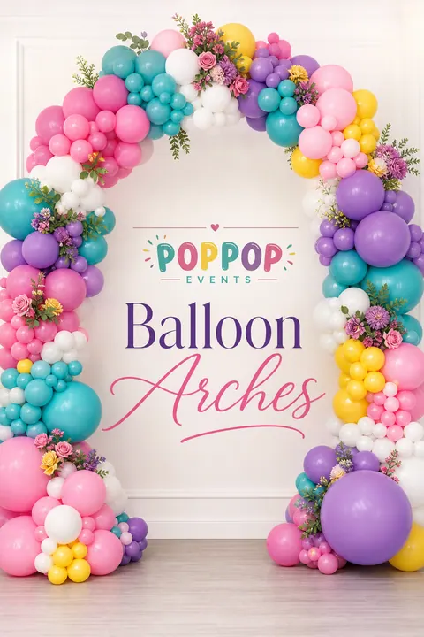
- Complementary — opposites with energy (coral and teal, or purple and gold). Bold and celebratory; use one as the star and the other as an accent.
Use the 60-30-10 rule
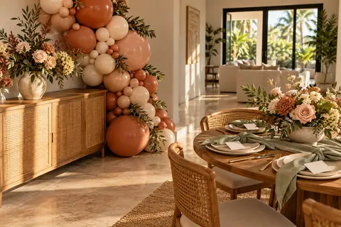
Designers swear by it for a reason. Choose a dominant color (60%), a secondary (30%), and an accent (10%). In a garland that might be 60% ivory, 30% sage, and 10% chrome gold. The ratio keeps things intentional instead of a 50/50 tug-of-war, and it is the fastest way to make decor read as polished.
Do not forget finish, not just color
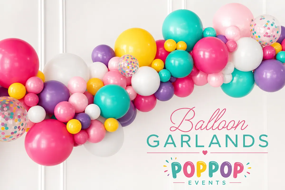
Two garlands in the same colors can look completely different depending on finish. Mixing matte, pearl, chrome or metallic, and a touch of confetti adds depth and catches the light. A few chrome gold or rose-gold balloons sprinkled through a matte palette is our favorite way to make a design feel instantly elevated.
Match the space, not just the theme
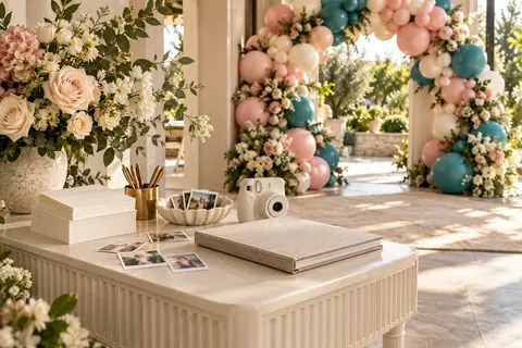
The most upscale installs echo the room: the venue walls, flooring, and lighting. Soft neutrals with a metallic almost always photograph beautifully and will not fight the space. If the room is already colorful, pull one shade from it into your palette so everything feels connected.
Common color mistakes
- Too many colors. More than three or four (plus a neutral) reads busy. Restraint looks expensive.
- All the same saturation. Mix light, medium, and deep tones for dimension.
- Forgetting a neutral. White, ivory, or sand gives the eye a place to rest and makes your accents pop.
- Clashing undertones. Warm and cool versions of a color (coral vs. fuchsia) can fight — keep undertones consistent.
Our PopPop rule of thumb
Pick 2-3 colors + one neutral + one metallic, set them in roughly a 60-30-10 ratio, and let finish do the rest. It works for a baby shower, a milestone birthday, or a corporate launch.
Not sure where to start? Browse our full color palette, pick your favorites in the quote builder, and we will match them exactly.
Bring this vision to life
Loved these ideas? Get an instant custom quote — Palm Beach County events answered within 4 business hours.